Folly
An end-to-end redesign of a points-based algorithmic social prediction markets app, influenced by trading terminals.
Folly is a points-based prediction markets app built by FollyLabs. Players can trade on outcomes with friends on anything from the winner of a Premier League match, to who runs the fastest time at running club.
The brief
FollyLabs were testing the first version of the app among a small group of users, so were already receiving a lot of feedback. They approached me with a number of recurring pain points that needed to be solved.
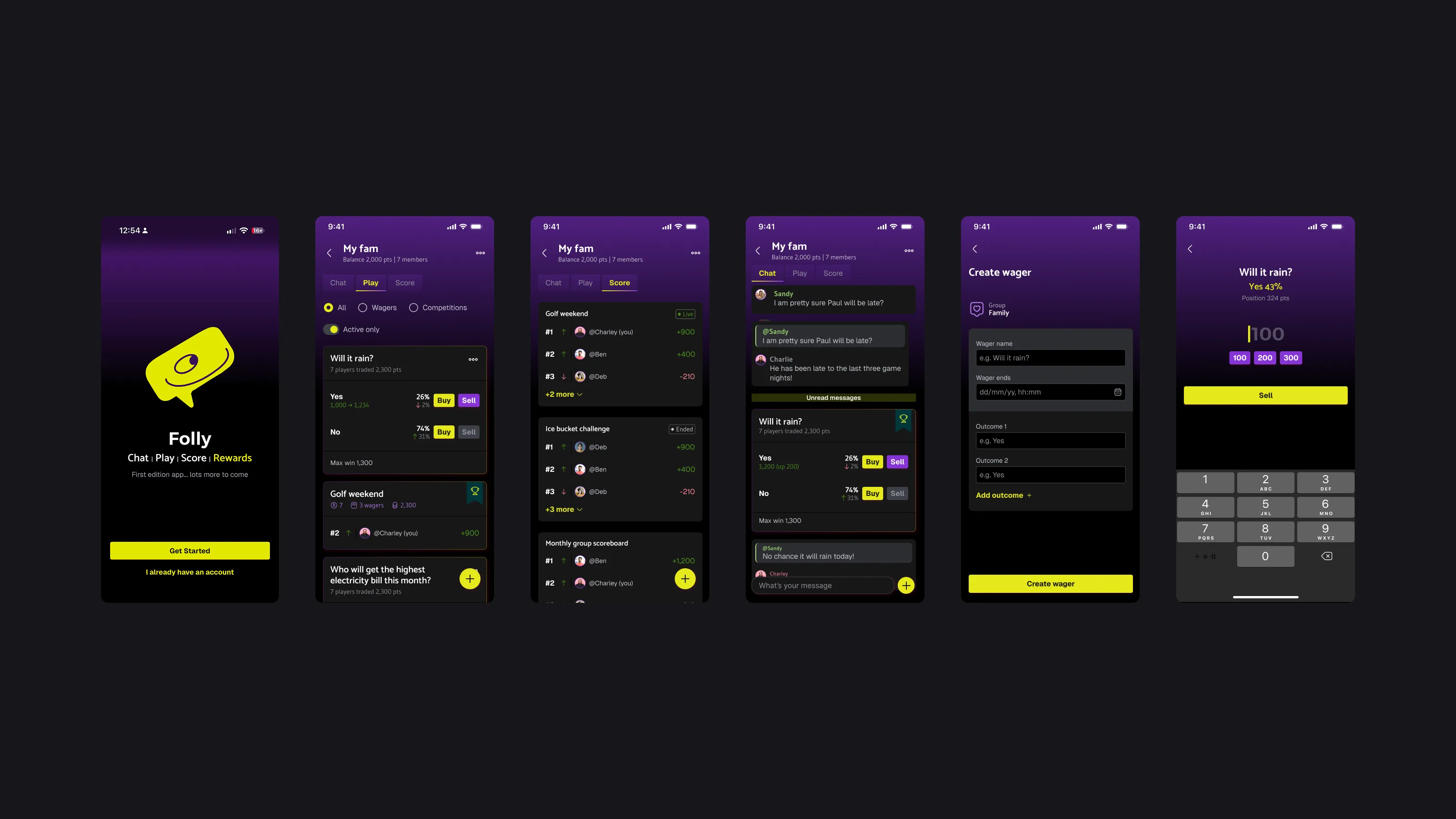
App hierarchy
The flow of information on the app was overwhelming and dense; players found it difficult to follow plays and keep track of their progress.
Navigation
The app lacked a main navigation for all the layers the app contained. Reducing the number of clicks and effort involved in play creation was a key focus of this project.
Create flows
Creating a play felt cumbersome. The AI agent helps a user create a play, but in its chat window form it feels too rigid and robotic. Overall, the process felt too much like data entry.
Visual design
The app felt too barebones and lacked personality. FollyLabs wanted the app to feel engaging and friendly but with a trading app edge. This needed to be consistent, from the onboarding journey, to celebrating a player’s win.
Interaction design
The app lacked the polish needed for an app with gamified elements, and a lot of the interactions felt lacklustre.
Project overview
This was a short-term project where I delivered an end-to-end redesign from UX improvements to UI polish with a new component-based design system and theming, serviced by a new brand identity. By using AI alongside Figma, I was able to build a working prototype that helped demonstrate a more engaging and fun experience with thoughtful interactions and animations, and bring data design to life.
Target audience
Folly’s target audience is 18 to 30-year-olds with an interest in sports, who enjoy competing against their friends, and making bets on outcomes for a range of different activities. With football being a key focus for the early stages of the app, FollyLabs want to target Fantasy Football users who already compete in groups with their friends, with a live in-play prediction markets alternative.
Project scope
With only a short time to spend on the project, we needed to take a lean approach. Folly had already established the key problem areas as part of the brief; the key improvements to make were the screen layouts and transitions, the information architecture, and the visual design. We agreed on a more lightweight approach to gamification, particularly animations that could be refined further down the line. The goal was to get the app in a polished state, ready to ship, with additions to elevate the experience as part of the update cycle once the app was out in the wild.
Information architecture
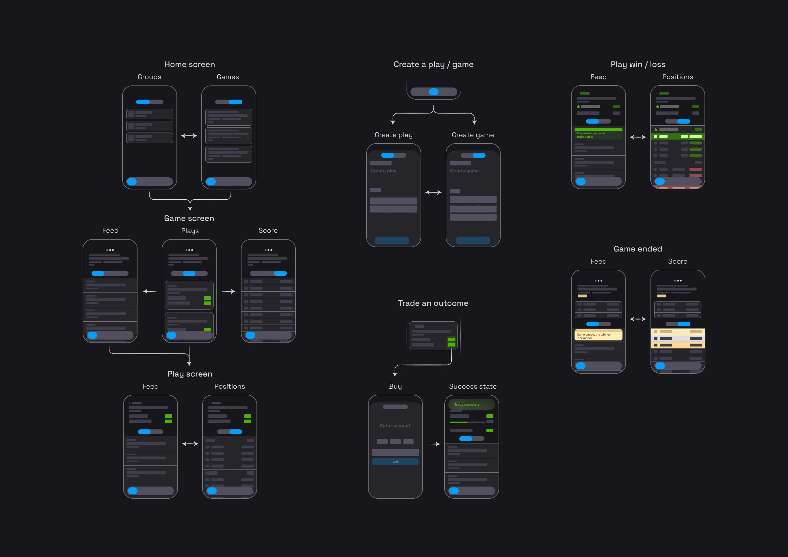
I mapped out the main flows of the app with a new main navigation bar at the centre of the plan. The home tab would be where the user can navigate from their groups, all the way to opening a play - keeping the core flow contained under the same tab. The Explore tab is the app’s discovery page, where players can find games tailored to their preferences. In the old app, creating a play was a time-consuming process. Here, tapping the create tab opens a context-aware sheet, allowing the user to create a play quickly without losing their place on the app.
Interaction design
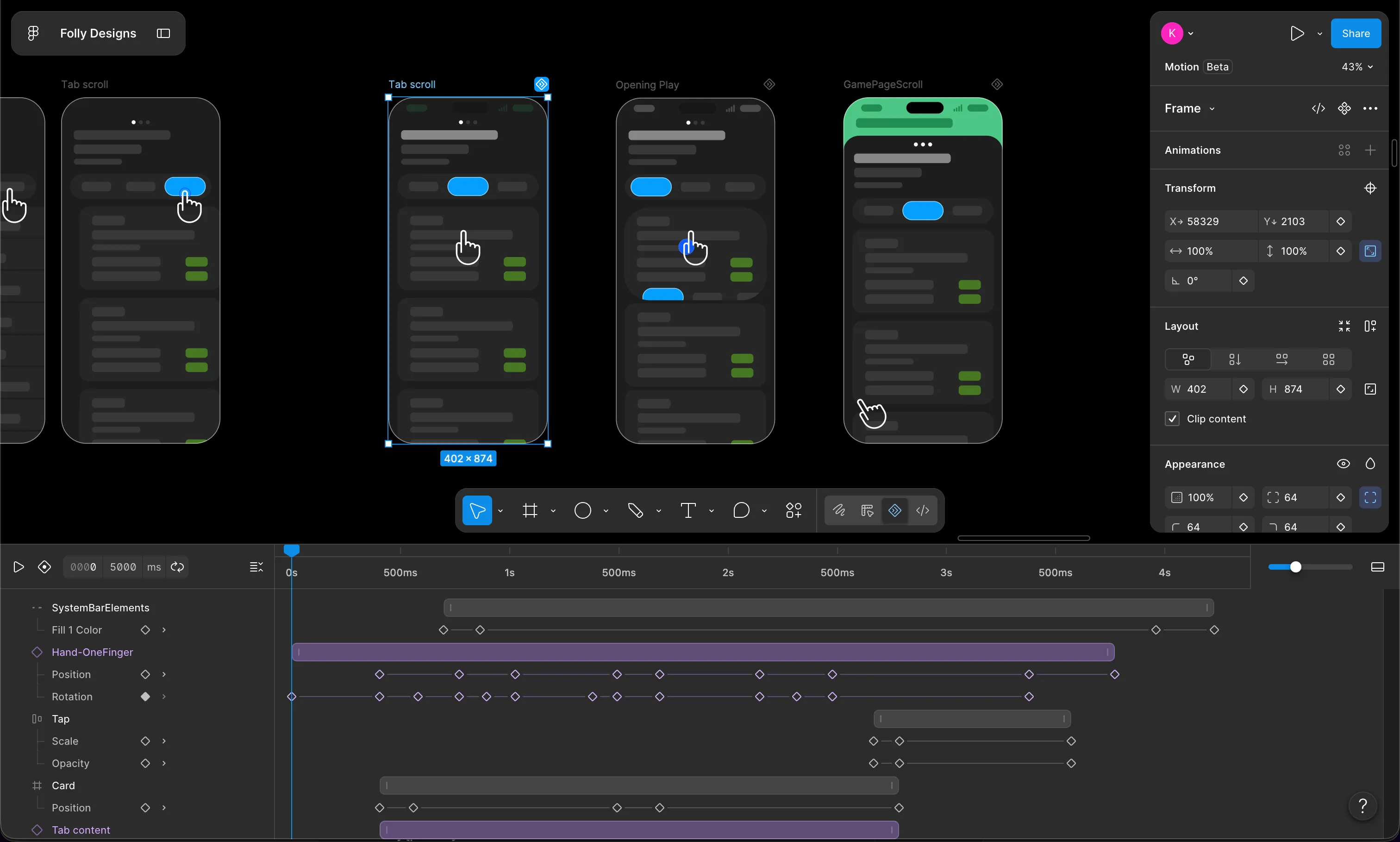
I wanted to bring the app to life with a selection of more considered page transitions than the stock page swipe the original app used - giving the feeling of a simple web app. The original app was also lacking many of the necessary gesture actions such as navigating a secondary nav bar using left or right swipes.
Where I felt we could improve was giving more personality to the more heavyweight interactions. Examples such as a play card filling the UI on selection, elements retreating from view when a user’s attention is elsewhere, or a game sheet subtly snapping to the top of the screen when scrolling through plays.
UI & design system
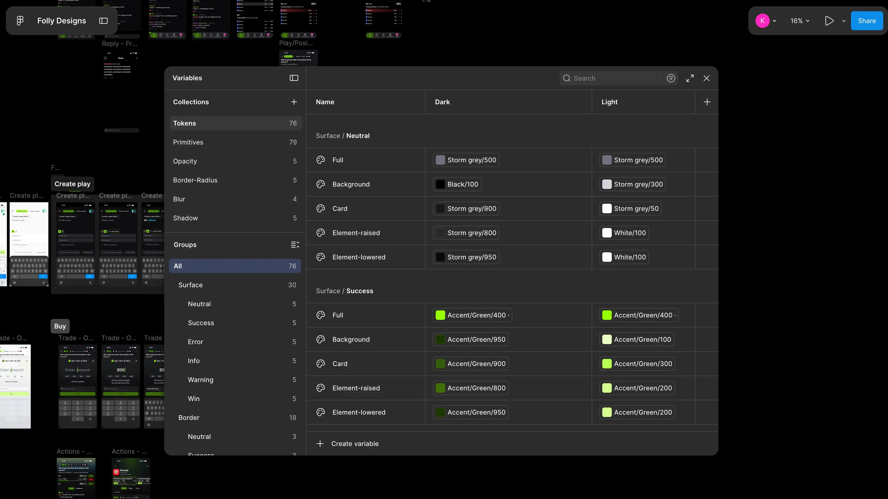
For the UI, I developed a design system and cohesive visual language that conveyed a more engaging and friendly approach, softening high-density screen layouts with rounded corners, a more characterful font choice in Geist, and a less sterile colour palette with injections of neon green as the main accent / brand colour. I assembled a design token library with semantic token names to provide engineers with better control over primitives from colour to blur strength.
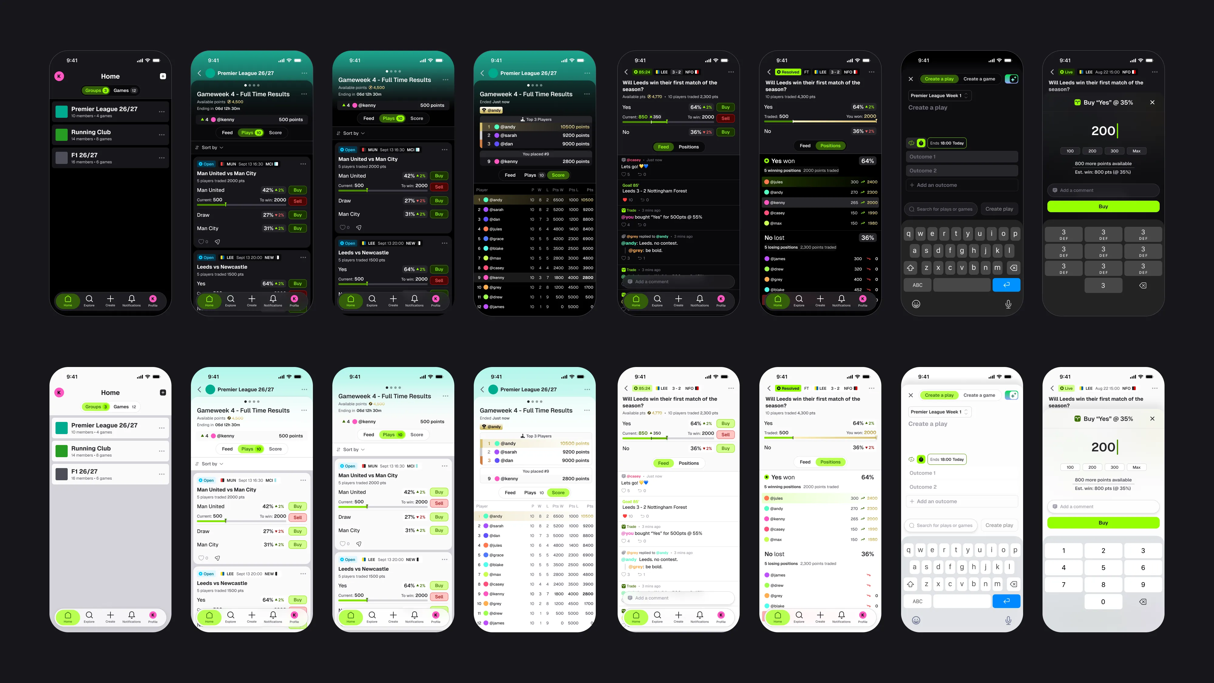
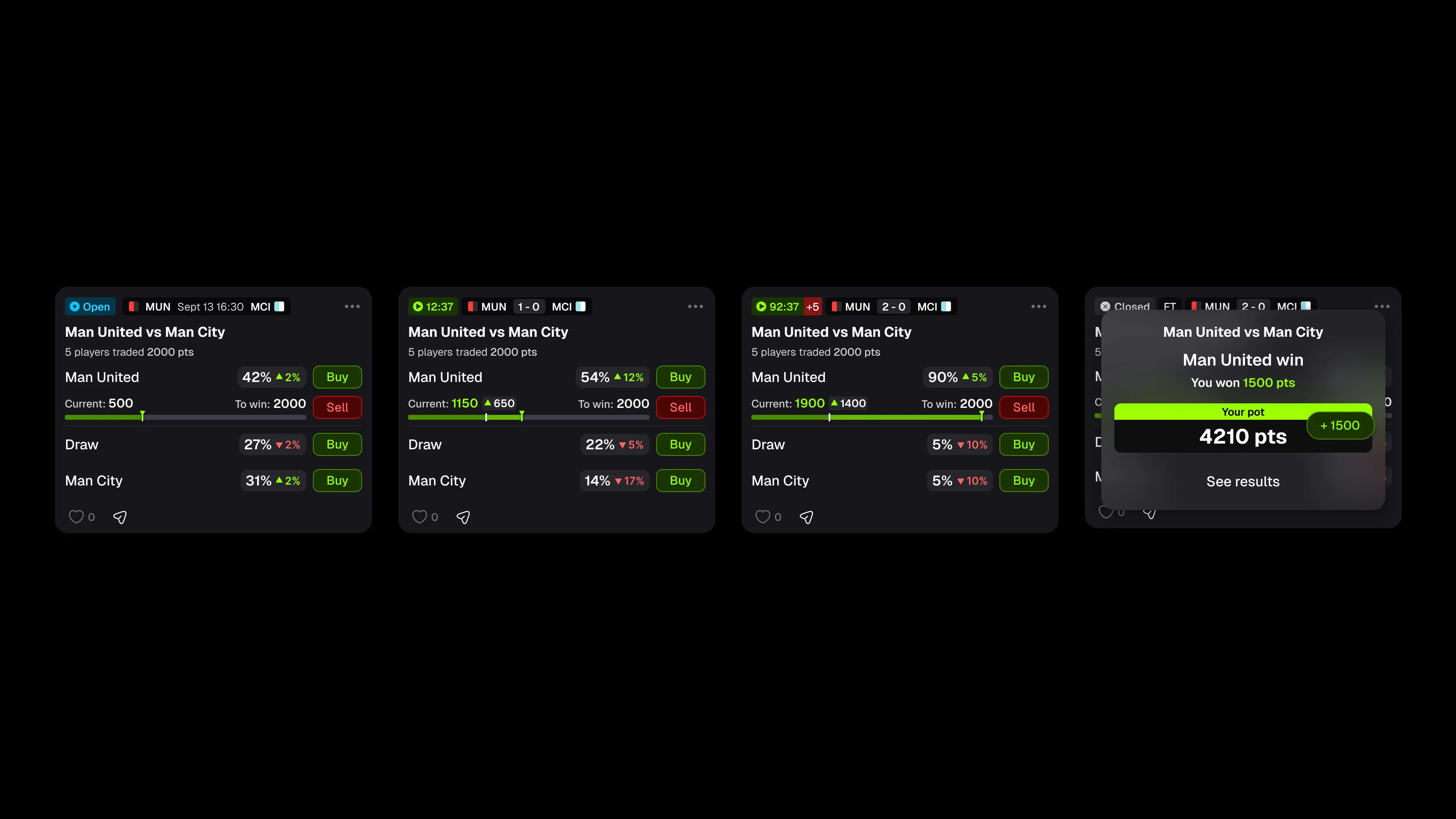
Live events will play a part in the Folly experience. Initially focusing on football, plays will be directly influenced by match updates fed by an API. These updates will be displayed on the play’s scorecard, so when the ball ends up in the back of the net and the scorecard flashes, the outcome prices shift as a direct response, and a player’s position is affected.
Logo redesign
I redesigned the logo with the aim of using the ‘F’ from Folly to convey price movement. The shape sweeps up through the stem, mirroring a line chart as the price bumps up. The logo is also used as the centrepiece for the app’s loading screens, and features as the coin icon for the points system in the app.

Key features: Prototype demo
In the early stages of the project, I focused solely on more traditional tools to conduct research, develop design concepts based on feedback, map out the IA and produce high-fidelity, component-based static screens in Figma. Once at the point we were happy with the designs, I started to assemble a working prototype using Claude Code. At this stage I was able to fine-tune the interactions and iterate the designs with Claude Code and Figma working together to keep the design file and the prototype in sync. On Folly’s side, their engineers were able to pull from the project’s repo and apply directly to the app build.
From a design perspective, building a prototype in AI offered the opportunity to create detailed simulations with working buttons, dynamic pricing and a play screen that feels alive, which made it vastly superior to a clickable prototype to get a feel for the app.
The Home screen is where the player can see the groups they’ve joined and the games they’re participating in, all in one place. A player can create a group that follows a particular theme or interest with different groups (5-a-side group, Formula 1, Running Club) and invite others to join. Each group contains games that can only be seen by others in the group.
Swiping to the Games tab shows the player summary cards of all their games from each group in one place.
A game is a competition consisting of plays that runs for a set amount of time. Each player is provided with a starting pot of points to trade on plays with. A game can contain multiple plays where the players trade their points and grow their pot. At the end of the game, the player with the most points wins.
The game screen is where the player can see all the plays contained within that game. The player can see the game’s activity feed, plays and scoreboard by navigating the tabs, or swipe across the header to navigate to other games.
A play is essentially the wager where a player can trade their points on different outcomes. This is where strategy plays a vital part in a player’s experience. A player’s risk aversion, timing and even ego can work for or against them. Cashing out at the right time on a shrinking position might be a better strategy than waiting for a change in fortune.
The play screen is where the player can see the play’s feed, trade on an outcome, and see how opponents are performing. They can measure their trade’s performance, add to their position or cash out easily from here or the play card in the game screen.
The create button is the central button on the main nav and a key part of Folly’s user journey. From here the user can create a game or a play, choose outcomes and set end times.
A few details to aid the player include: a pre-populated game field when creating a play while browsing a particular game, an early AI helper concept that recognises a Yes/No question and pre-populates the outcome fields.
I designed a tutorial mini game that puts the player up against an AI in a dice game head-to-head in front of a group of AI spectators. The player kicks the game off by placing a trade and then tapping the Roll dice button. Each roll of the dice shifts an outcome’s price as probabilities change and the spectators buy and sell their positions.
Using a quick and simple game of chance felt like the best way to demonstrate the mechanics of Folly.
Final thoughts
This was a really interesting project to work on that covered a lot of unique challenges. We covered a lot of ground in a short space of time, and while testing will of course continue, the changes made will hopefully contribute to a successful launch.
FollyLabs are set to release Folly this autumn.